Wednesday 11 January 2017

Summative Statement

In a world in which feminism exists, often pandering to the cis-white female, this artist’s hardback book and exhibition hopes to break through the pre-existing boundaries into something far more diverse. Including interviews discussing the realities of six women, this piece aims to open up a discussion around the inclusivity of today’s feminism, the difference in realities each woman face, and how we choose to communicate as a collective.
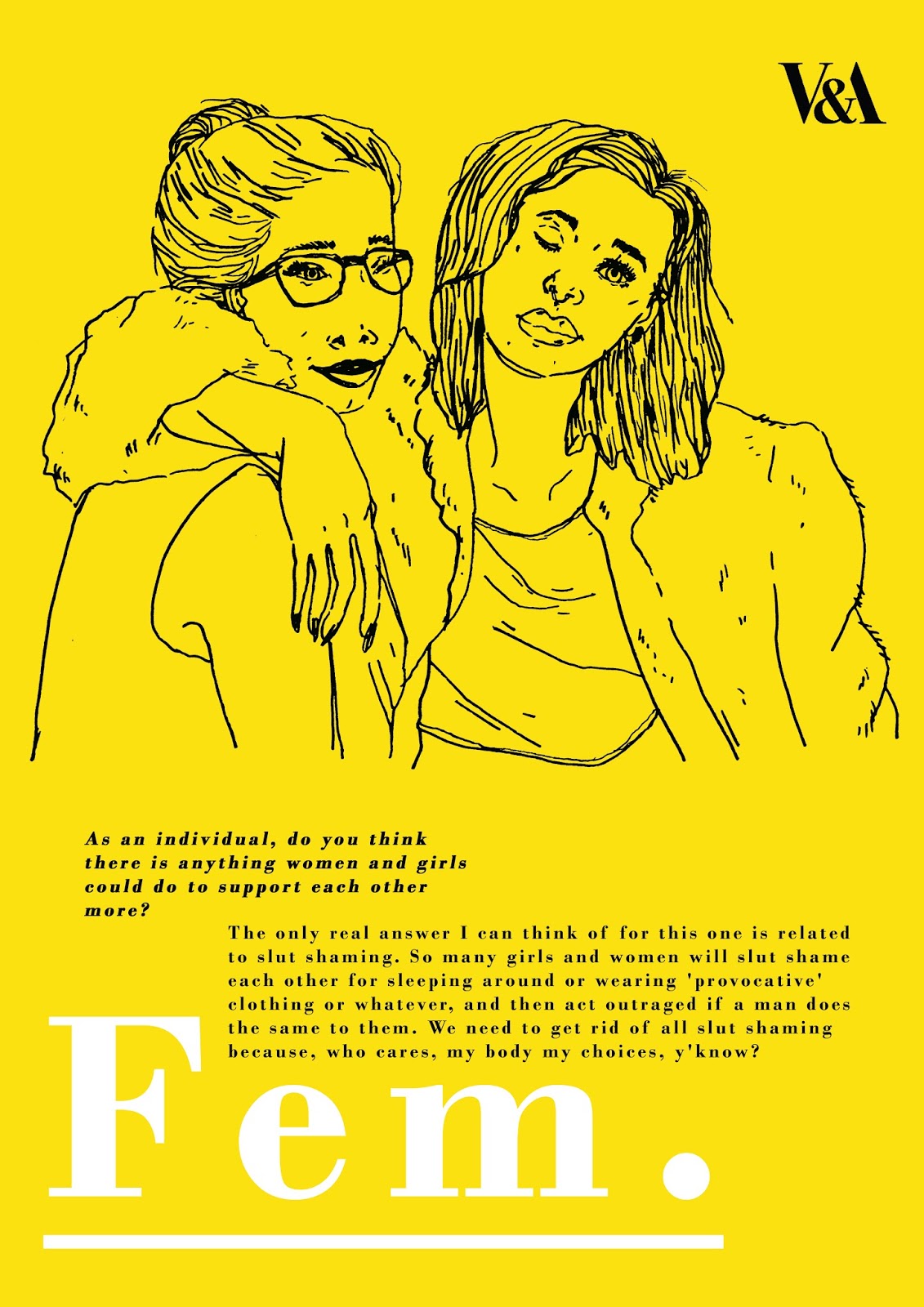
The hardcover book includes; six interviews/ discussions with women, a belly band title, yellow card insert explaining the context and aims of the publication, and a yellow bookmark promoting the variety of women this publication includes and supports.

Proposal of an exhibition around the book would include; copies of the book both for viewing and for sale within the gallery shop, A3 posters with imagery and quotes both from the book itself and additional quotes from the interviews (not featured in the book) for both exhibition and sale, as well as additional promotional and advertising documents such as street/ London Underground posters, bus advertisements, etc.


Overall this project hopes to be a celebration of the variety of women within today’s society. Informed through a body of literature research into female zine culture, Fourth Wave Intersectional Feminism, and women's relationships with the internet, this project hopes to inspire further acceptance of inclusivity through the active participation of Intersectional Feminism. 

Final Design Boards

Visual & Conceptual Development

Additional Posters


In addition to the main advertising poster for the proposed exhibition, I wanted to make some mock ups of other posters that could be sold in the gallery shop alongside the book. This was relatively easy to do as I just reused the imagery from earlier in the project. I kept the same colour scheme so as the exhibition would be a cohesive body of work.

Gallery Mock Up


Thinking from the last peer review, I decided I'd add a gallery mock up of my work to the design boards. I think it's good to see the work in its environmental context, and it was something I wanted to engage with before the final hand in.

Tuesday 10 January 2017

Initial Design Boards & Feedback


Initial Design Boards (uncomplete)

Feedback from Peers

Self Evaluation

Exhibition Poster Choice


Proposing this book as an exhibition piece was something I've had the intention of doing for a while now. My idea was that the book would be the central focus of the exhibition, but posters would be made from images and quotes used within the publication and from the interviews. I did want a central advertising poster for the exhibition however, to use on the majority of advertising.

I thought about using the title alone, but I wanted show some of the imagery used within the publication. I think it makes the advertising more engaging, and speaks more clearly about the content of the exhibition.

When it came to choosing the image, I did already have one in mind. My interview with M really struck me as one that stood out, and her parting statement really left an imprint in my mind. "For me, the most prized thing about being a woman is knowing that I am living true." It really encompassed something powerful and proud that I felt I wanted the exhibition as a whole to encompass.

I made the image yellow to fit in with the spotlight colour of the book and to stand out rather than keep it black and white. Also adding in the V&A logo to make it look more realistic.

Final Hardback Book


I constructed the final book as a handmade hardback book. When it came to the title of the publication, I chose to go with a belly band printed in the same paper as the pages to give it a sense of consistency.

I like the minimal look of the final book and I'm quite happy with the overall construction! It's a little wonky but not overly noticeable. I think the design choices I made help communicate the serious tone of voice I wanted the final piece to have. While I wanted it to be an honest and open publication, I wanted the interviews to be presented in a way that demanded the respect I felt they deserved.

Monday 9 January 2017

Printing Problems

I'd thought all along I was going to print my images digitally, using the paper I'd bought from the library as a stock to ensure a good quality outcome. As mentioned previously I tested the paper out on the printer in the illustration studio. This printer is fine for preliminary tests, however when it comes to printing quality it's not as good as many other printers within LCA. I had planned to place my paper into a side tray of one of the drop in rooms as I had done for a project last year, however I found very quickly that wouldn't be the case.

The uni changed it's printing policy so you can no longer put your own paper in the drop in printers.

This caused quite the last minute stress to my project. I didn't have a digital print slot as I never envisaged needing one. So now, what did my opinions leave me?

The answer lay in one of the key components of this entire research module; the photocopier. And as zines have been made for many years so to would this book be. I was a little apprehensive about this at first as I knew the photocopier often left unintentional marks on photocopied pieces. However after a few trials to see how it looked, I really fell in love with the final resolution. I think the paper quality allowed the marks from the photocopier to look refined rather than messy. And the overall aesthetic harked back to the female zine movement that birthed this entire module. I'm actually quite gland I couldn't print this final on a normal printer. The photocopier is my best friend ♥

Paper Tests


When it came to the printing of my final book, I knew paper quality was something I would have to look into. When I've made zines previously, I've used relatively cheap paper as it fits with the DIY aesthetic, however with this publication, as I wanted something more crafted, paper was something I would probably have to invest in.

Ideally I wanted something off-white. I thought if I printed the images on pure white paper they may look a little bland, and giving it a tint of colour would make the overall final appearance more considered.

I found some paper in the library that was an 'antique white card'. What I liked about this paper, other than the colour, was the thickness. I wanted my publication to feel like a good quality product, but I didn't want to use card that was too thick as it would make the binding process more difficult; more mm would need cropping from the edges once it was bound.

Before printing my final onto this paper I ran it through the studio printed first. It gives a high contrast finish and feels nice to hold in your hand. This is the paper I will be printing my final product on.

Saturday 7 January 2017

Pages Layout


I scanned in the images from my initial drawings and picked out the ones I felt worked best with the extracts from the interviews. I then played around in photoshop with the composition of words and images until I felt confident with each page. Altogether, there is 12 pages of content, but there will be an additional four blank pages added to the InDesign document so that I can bind it as a hardcover book.

Friday 6 January 2017

Creating Final Images & Choosing Content


I finally began exploring the answers I'd been given through image making at this stage. It feels so good to finally be able to tackle this project with illustration. Though the content of this publication is the most important thing, I'm glad I've got the chance to finally engage with these answers on an image making level.

I wanted to keep the images quite raw and loose; harking back to those of female-zines.They still had to communicate the serious and mature content of the interviews but with an essence of personality. I enjoyed working on these images in my sketchbook as it allowed me to not be too precious in the image making process. At this point in the project, I was also beginning to feel the restraints of time. The answers and content I've had from the women that have engaged in this publication with me has been amazing, however time management hasn't gone exactly to plan. Waiting on others has been a real difficulty in this project, and I wish I had had more time more exploration and experimentation.

This said, I believe the images articulate the meaning and content of the publication well. Although they're not highly refined I would be doing myself an injustice to say they weren't crafted. There's a rawness to them that I think goes hand in glove with the emotive and passionate way many of these women spoke within their interviews.

I also found that once I started drawing it became more apparent which parts of each interview was most important; spoke openly and honestly about their personal circumstance. There were particular quotes I picked out to write by hand to give them extra emphasis. I didn't want the final piece to read at something repetitive and stationary. I wanted the composition of each page to differ, allowing the words to move around the page and visual represent something more fluid (dialogue). I think this also helped break up each individual segment so they were easier to differentiate.

Sunday 1 January 2017

Final Publication Visual Presentation Boards


With all my final answers collated, I've put together a few design boards exploring the aesthetics I'm considering with my final publication. As I mentioned before, I really feel at this point I want to make something crafted and considered that allows for these women's answers to be taken seriously. Zines are such valuable pieces of artwork and social commentary, but they can feel a little "throw away" to certain people. I want this piece to be a statement about intersectional feminism and it's use of female zine culture's honesty. In order for that to be achieved I feel I have to create something that feels a little more permanent. I'm definitely making my main final outcome a physical hardback book that would be distributed as an artists book. Then propose an exhibition alongside this.