1. What skills have you developed within this module and how effectively do you think you have applied them?
I think the main skill I’ve developed this module is how to properly, and to an organised degree, research a subject, choose appropriate material and form an opinion on it. Writing a properly referenced and researched essay isn’t something I would say I felt particularly confident doing, however I feel through this module I’ve gained a lot of experience in and feel much more equipt to doing in the future.
Using drawing as tool for understand research and fighting through problems is also something I feel I’ve developed and has been very beneficial and crucial in the development of my visual diagram and organisation and appropriation of my research.
2. Which approaches to/methods of research have you developed and how have they informed your practical outcomes
The seamlessly simple act of choosing what material is appropriate and relevant has been something I’ve really had to learn from in this module. Often I would get side-tracked and it was easy to feel at times overwhelmed by the research when I wasn’t choosing what was appropriate. Also, being able to take a body of work such as a theoretical book and skim to find the relevant parts was also a skill I’ve learnt through this module; it’s much easier to look at the contents or index and find a relevant chapter than try and read a whole book.
Again, using drawing as a form of understanding and making sense of research was something new to me, but inevitably became an integral part of forming links within all the research I had conducted.
3. What strengths can you identify with your work and how have/will you capitalise on these?
I think the presentation of my work is something I’ve taken pride in, I’ve really tried to make my essay, pecha kucha, and diagram as clear and concise as possible; trying to get across my ideas in an accessible way particularly with the pecha kucha and visual diagram.
Although at the start of the module my skills at research, I feel, were quite poor, I believe they have improved vastly through the module. I also feel that the research I conducted in response to SB2 helped me when revising my draft of an essay in SB1. This wider understanding of my subject allowed me to analyse what I was saying in my essay with greater depth and understanding.
4. What weaknesses can you identify in your work and how will you address these in the future?
I do feel as though my essay still could have been better researched. I could have drawn upon more visual references to make my points as well as looking at more psychological and sociology theories and writers. Although I feel my essay was informed, I feel as though I lacked a real opinion on the matter and felt a little overwhelmed. I think writing about something I can really get interested and invested in next time would help with this as I feel it impacted in the form of a lack of motivation.
I also worry that some people may misinterpret the visual diagram as something too literal and think I’m playing a sort of ‘blame game’ which was not my intent, though it’s hard to gage the reaction people will have to the diagram until after the crit.
5. Identify five things that you feel will benefit you during the next years Context of Practice module?
- I think just the overall experience of going through COP will help me next time; understanding how it works, how to blog, research, and write and with intent.
- The skills I’ve developed in research will really help me with next years COP. Towards the end of the module I felt as though I really got to grips with research and got interested in it, as opposed to earlier on in the year where I felt as though I didn’t really know what I was doing or how to tackle something as large as research.
- The act of choosing APPROPRIATE research will also be very useful next year. Taking the time to really understand what you’re interesting in researching, what aspects of it you want to look at ect can really save time later on. Early on this year I took out a lot of books that turned out to be rather useless to me because they weren’t really relevant to what I wanted to research; having a clear direction from the start is key.
- Knowing that the research will also be turned into other forms of communication (pecha kucha, diagram) as opposed to just an essay is also useful knowledge, not only as it allows me to prepare to take the research in a new direction, but it also allows me to look at research in a new light.
- Looking at sources other than text based books and websites can also be useful. I gained knowledge during the development of my visual diagram through watching documentaries as well as reading. Looking into podcasts, online news stories and documentaries could also be useful next year during this module.
Thursday 7 May 2015
Wednesday 6 May 2015
Visual Diagram Evaluation

Final poster design
.JPG)
.JPG)
.JPG)
.JPG)
.JPG)
.JPG)
Printed poster (Visual Diagram)
STRENGTHS
Managed to wrestle with layout to get to something that shows links clearly without looking like a mess//not too many overlapping arrows
Colour scheme works well (feel there's a good colour balance too) together whilst also fitting with subject matter
Draws together all my research in an accessible way
WEAKNESSES//CONCERNS
That the diagram will be taken too literally (e.g. people will think I'm trying to play a blame game "supermodels are responsible for all eating disorders" or "Robin Thicke sexually abuses women") rather than an exploration of the sexualisation of women
That people won't understand the links or will dismiss ones they don't agree with without thinking about them or what links them
The arrows look a little unprofessional and are something, if done again, I would spend more time on
OVERALL
I'm quite pleased with the overall final outcome and feel as though my research has really informed the way I've gone about constructing this diagram. As previously stated, my aim was to expose all the different links and forms in which women's sexuality is being presented and at times exploited. My main concern with this poster however is that people will take offence or view it in the wrong light. I hope that I was able to display this information in a way that allows people to form their own opinions and I suppose in a way, even if people disagree with the links I've made at least my poster has got them THINKING about it and FORMING THEIR OWN OPINIONS. In regards to this concern however I am quite confident in the fact that these links are based upon research and a deeper understanding of this subject matter than I had at the start of this project.
Final Visual Diagram Construction
Some scamps for final poster and rough final diagram layout
Once I'd selected appropriate imagery for each of my ideas I scanned them in and began arranging them on photoshop. This meant changing the sizes of a few of the images so they all fit together without it looking overly complicated. I was aware I was going to have arrows occasionally overlapping, however I wanted to minimise the effect of the poster feeling claustrophobic; if there was too many arrows crossing over one another and without a clear sense of organisation the 'links' within the poster could become in danger of being overlooked or too hard to read, therefore dismissing the entire message I was trying to convey.


Final images for poster
Once organised I started to add the arrows using the pen tool. After all the links were down I went about choosing a font; I had a look at Jean Jullien's work to see what sorts of typefaces he used in his work as I felt they had a similar bold black line quality to the illustrations I'd used within my own work for this poster.


Jean Jullien
Whilst a lot of his font's had a slightly textured and hand-rendered feel to them I found that most of them also tended to be of a quite bold sans serif style. With this in mind I began looking through the different fonts in photoshop until I found one that I felt fit well with my illustrations.


Barbara Kruger
When one of my peer's saw the poster they said the font reminded them of something Barbara Kruger-esque; which I found very interesting. While Kruger dealt with often different subject matter to what I'm dealing with within my own diagram, it could be said that links could be made. She also played around with the idea of women's bodies and societies opinions and views on it. I was pleased that such a link could be made and gave my confidence in my text choice.
I also choose to go with a limited colour palette in my poster. The black and white didn't have nearly as much impact as I wanted it to have. I added pink in the background as it's a colour stereotypically associated with women. I thought about using a bold 'hot pink' due to it's often 'sexy' connotations, however opted for a softer pink as I thought it would print better and the hot pink seemed too high contrast and uncomfortable to look at in such a large quantity.
Using a textured brush I painted the images in white to make them stand out from the pink background, as well as making the shapes in the bottom key white to balance out the black bottom heavy feel the poster had.
Final visual diagram//poster
Friday 1 May 2015
Further Development of Visual Poster after P.K. Feedback
More developed 'The anatomy of the sexualisation of women'
From the Pecha Kucha presentations I decided to add more to my final diagram through a little bit more research. Some of the feedback from the presentation helped a lot too in directing me to things like ASMR which I hadn't previously heard of, which triggered me into considering phenomenon such as cam girls and voyeurism as a whole.
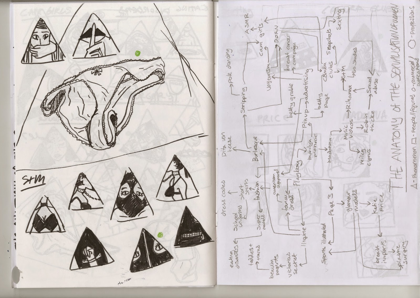
On a practical note I decided it would be best to categorize all of these ideas and separate them into basic geometric shapes, this would make the overall construction of the poster much easier in that I wouldn't be dealing with long figures, small items, differing shapes ect and trying to get them to fit together. It would also add another element of consideration of research and presentation of information to my A2 poster.
From here I began scamping out roughs for each idea, this was a laborious process but one I felt paid off. For some of the more serious issues such as sexual abuse and eating disorders I searched for posters already existing about the subject matter, although this did help to spark some ideas I did this mostly as I wanted to avoid the obvious. I feel as though with serious matter the more you can reduce the image by the more effective it could be. Through more visual integration of each idea, and repetitive scamping, I felt as though I found an image for each that communicated what I wanted to say about it in the most effective way. The media and monochrome created a sense of unity and continuity throughout the various subject matter which I also felt was important given the final format of this illustration.
.JPG)
.JPG)
.JPG)
.JPG)
.JPG)
.JPG)
.JPG)
.JPG)
.JPG)
Development of ideas and scamps
Development of Visual Diagram
Possible icons for particular aspects of poster
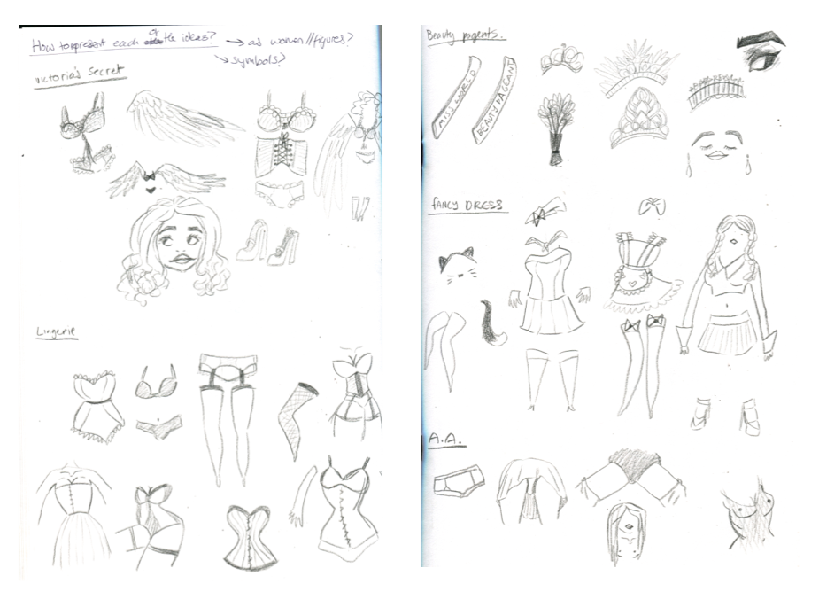
I was worried my poster was in danger of simply becoming a diagram of 'sexy' women in lingerie so decided that I wanted to represent some of these ideas with iconography. I tried this out with a few select ideas to see if it would work//whether it would be easy to differentiate the various ideas and found that due to my earlier research it was quite easy to simplify the concepts I'd researched into icons.

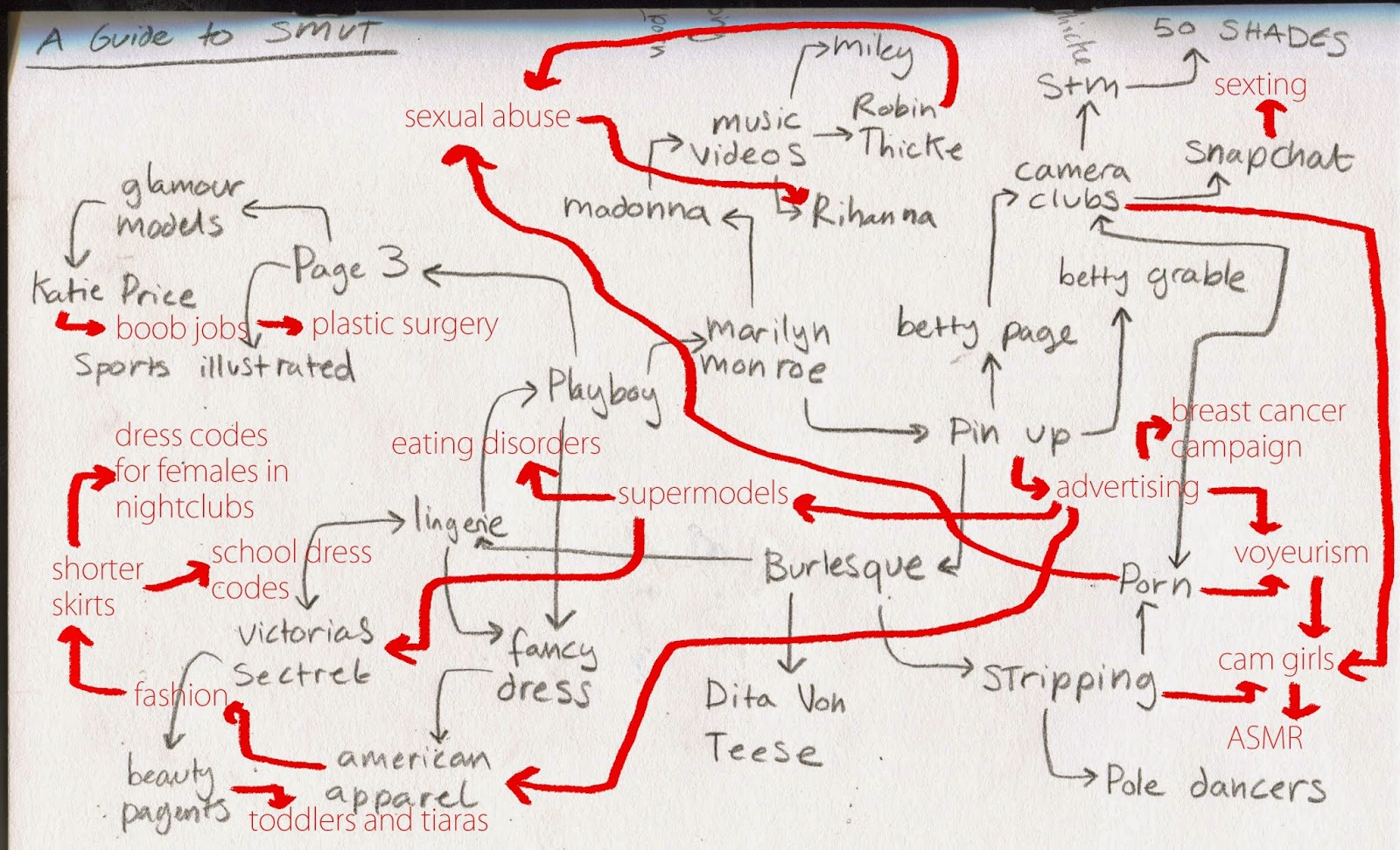
Rough//neater version of possible diagram
I thought it was also about time I locked down what exactly I wanted to include within the diagram and how these all linked together. The top left image shows my rough version, during which I was even still making new links once I'd written all the things down. The larger image shows a neatened up version of the map.

Exploring media options
In run up to the Pecha Kucha presentation I also started thinking about possible medias for my poster. I came across this vector pin up by Malika Favre and thought if I were to vectorise my images it could lead to a very graphic and sophisticated looking poster.
However I still liked some of the earlier media experiments I'd tried out in my sketchbook, I also felt this analog approach would perhaps seem more human and less clinical given the very human nature of my subject matter.

Experiments with vectors//layout
I want to include digital font and arrows in my diagram as I feel that'll lend itself better towards a clear diagram that most clearly shows the links I've uncovered through research. I also did some quick vector experiments tracing over some of my previous speculative drawings.

Rough mock up of simple layout
Pecha Kucha; Slides & Notes

Slide 1

Slide 2
Slide 3

Slide 4


Slide 5


Slide 6
Slide 7

Slide 8
Slide 9

Slide 10


Slide 11

Slide 12

Slide 13


Slide 14

Slide 15

Slide 16

Slide 17

Slide 18

Slide 19

Slide 20

REFLECTION
Overall I feel as though the presentation went well, I managed to keep to the rough times I'd practiced and felt quite confident in presenting my proposal and research. I'm glad I decided to go with the prompt cards rather than a full script as it helped to calm my nerves about tripping over my words and I feel allowed me to talk more directly and honestly about my research and subject matter. The general consensus that this is a complex matter and that to expose it would work as a good way of getting people to think about it and form their own opinions was particularly good to hear. The feedback was also helpful in terms of media; I think I'll dismiss the notion of vectors as I agree it could just make the poster look generic and too traced//graphic design and not enough illustration.

Feedback sheet
Subscribe to:
Posts (Atom)