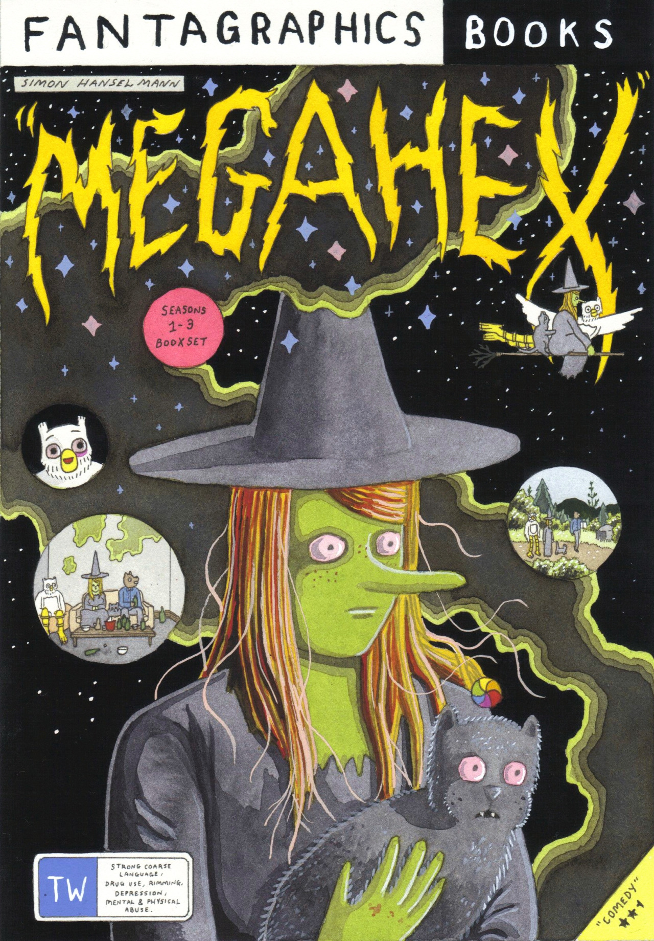
Megahex; Simon Hanselmann
Simon Hanselmann is a self taught illustrator from Tasmania whose main work, Megahex, features "twisted, hilarious, and gorgeous webcomics" surrounding the issues facing many of today's underground societies, communicated through an authentic and relatable tone of voice. His mother, a drug addict, could be said to play a large part in his comics as a whole, Hanselmann himself often implies that the comics are part autobiographical ("So I put everything into the comics, and that’s my art therapy."); fixed solidly within the realms of reality but seen through the looking glass of some surreal, anthropomorphic characters. This idea of the works being prejudged by the private lives of the author coincides with Roland Barthes theory in which he challenges the idea that readers are only capable of looking at works in relation to their authors. Barthes quotes that "The Author is thought to nourish the book, which is to say that he exists before it, thinks, suffers, lives for it, is in the relation of antecedence to his work like a father to his child." In regards to Hanselmann this could be seen as true, that his private life and background have fed directly into particular aspects of Megahex, however this may not necessarily be a bad thing. Due to this integral link between Hanselmann's experiences within the drug world and counter culture, his work offers a sense of honesty and real world value that may not have been translated as well to the reader otherwise.
Leading on from this of course, is the notion that not everyone who picks up Megahex will be familiar with Hanselmann's experience within the 'stoner culture'. At this point the reader is taking the images and illustrations at face value, not knowing whether they have a relevance to the author at all. Barthes states that "To give a text an Author is to impose a limit on that text" and whilst this may prove true in the way that readers may prejudge and have their experiences of the characters and story lines altered when Hanselmann's past is revealed, in this instance I believe it could also be interpreted as giving the comics a sense of authority that may have seemed fantastical or stereotypical had the author's private life not been revealed. Steven Miles argues that "through design many consumer objects have lost their meaning insamuch as they are essentially anonymous and inauthentic" and I believe that Hanselmann's Megahex and openness about his past work together to dismiss this idea that design has to commerically mainstream and inauthentic; perhaps the Author doesn't have to die for the work to seen as something of value that can be freestanding. Perhaps the work can speak for itself, but be strengthened through the author, whether they are imposed on the work or not.


.JPG)
.JPG)
.JPG)
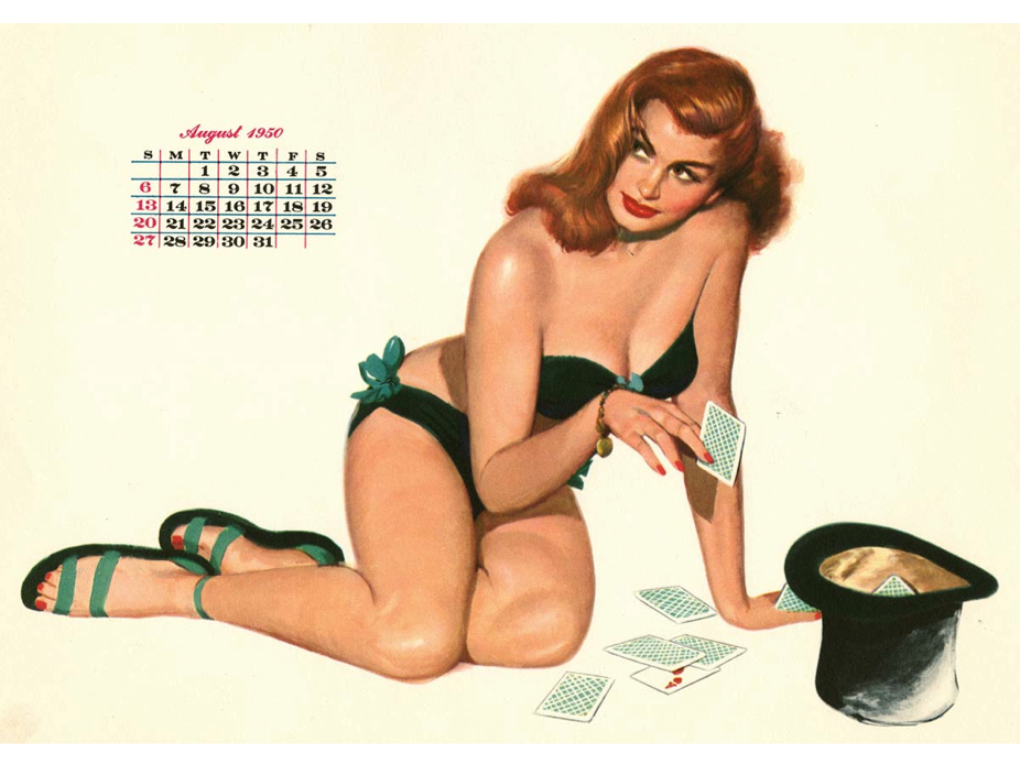
.JPG)
.JPG)
.JPG)


.JPG)
.JPG)
.JPG)
.JPG)
.JPG)
.JPG)
.JPG)
.JPG)
.JPG)