Wednesday, 3 December 2014

Study Task 5; Essay Plan

Mind Map to help with planning my essay/exploring ideas

Suggested Title of Research Project - The sexualisation of women through advertisements during the 1950s compared with contemporary advertisements

Significance - In order to fully form an opinion and theory on this subject matter I first have to understand it. This additional and in depth research has already started to inform my opinions and ideas much further than they were are the very start. The idea of a comparison also something that I'd really like to do and could, I believe, really help in furthering my understanding of both sides to this comparison.

Primary and Secondary Sources: 
  • Hughes, R, Lifestyle Illustration of the 50s, United Kingdom: Innovative Logistics Llc. 
  • Anon, 1950’s Illustration: When Mass Media Met Pop Culture. Available at: http://www.fuelyourillustration.com/1950s-illustration-when-mass-media-met-pop-culture/ [Accessed October 30, 2014]
  • Notes on ‘The Gaze’ (no date). Notes on The Gaze. Available at: http://www.aber.ac.uk/media/Documents/gaze/gaze02.html (Accessed: 3 December 2014
  • The Gender Ads Project (no date). The Gender Ads Project. Available at: http://genderads.com/ (Accessed: 3 December 2014).
  • Catalano, Christina (2002). Shaping the American Woman: Feminism and Advertising in the 1950s, Constructing the Past: Vol. 3: Iss. 1, Article 6. Available at: http://digitalcommons.iwu.edu/constructing/vol3/iss1/6 (Accessed: 3 December 2014)
  •  (no date). The 10 Most Sexist Ads of 2013. Available at: http://www.adweek.com/adfreak/10-most-sexist-ads-2013-154550#intro (Accessed: 3 December 2014).
  • A black eye and an iron..seriously? (no date). Gibson. Available at: http://vickiandcharlie.tumblr.com/ (Accessed: 4 December 2014).

Methods - Reading secondary sources will make up a large part of my research, however I have also thought about how my image making could inform my essay. I thought about subverting the general characteristics of both eras of advertising, so drawing a vintage-style woman smiling holding an iPad with hyperbolic text around it, and another image of a woman straddling a vacuum with some ambiguous text next to it "Be as dirty as you want"

Limitations - The comparison in how women are sexualised through the media and advertisments in 1950s compared with now. Was it more innocent and subtle back then compared with now? Are we more or less aware of it than society was in the 50s?

Essay Plan
a) Introduction (300 words): Describing how and why the question/theory posed will be answered

b) Main Body - (1400 words): Include a summary of the main points of your argument, and how the argument will develop. Show how theoretical research will be incorporated into your argument.

c) Visual Examples (1000 words): Focus on no more than 2 or 3 for an essay of this scale.

d) Conclusion (300 words): Sum up points made/argument proved or disproved

Images Related to Essay Theme?

http://www.vintag.es/2013/03/pepsi-cola-ads-1950s.html

http://galleryhip.com/1950s-advertising-women.html

http://www.dailymail.co.uk/health/article-2107948/Cancer-tragedy-women-targeted-cigarette-adverts-post-war-years.html

http://www.bouncecolor.com/2014/09/vintage-sexist-adverts-from-1950s-and.1960s-that-objectify-women.html

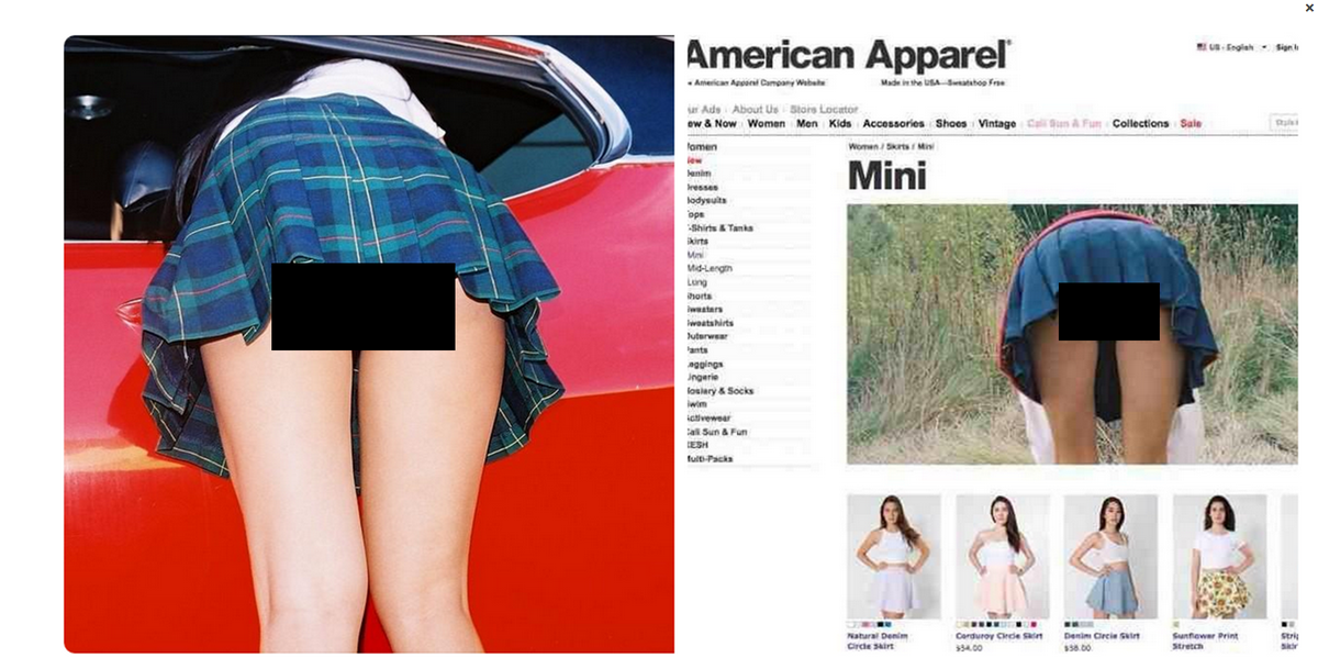
http://www.independent.co.uk/life-style/fashion/american-apparel-slammed-for-rampant-sexism-in-latest-controversial-advertising-campaign-showing-model-in-miniskirt-9654844.html

Thursday, 30 October 2014

Harvard Referencing: Quotes/Sources for Essay


  • Hughes, R, Lifestyle Illustration of the 50s, United Kingdom: Innovative Logistics Llc. 
-"The fifties was an era if forward-looking optimism, and the hopes and desires of these transitional years were elegantly captured in the stunning commercial artwork of the period." (Front sleeve)
-"The thriving women's magazine industry employed many of the most influential artists and illustrators of the day, but the ephemeral nature of the format meant that many of the artists work was predominately seen one day and forgotten the next." (Front sleeve)
-"consumer dream" (Front sleeve)


  • Anon, 1950’s Illustration: When Mass Media Met Pop Culture. Available at: http://www.fuelyourillustration.com/1950s-illustration-when-mass-media-met-pop-culture/ [Accessed October 30, 2014]
-"Welcome to the wonderful world of the 1950’s illustration. It is filled with illusion, abundance, naiveness and optimism. In no other time in history has illustration been so incorporated into the society – representing and defining it’s ways and norms – as it was in the 1950’s."
-"Following the end of WWII western economies bloomed, and consumerism began to spread. During the 50’s the average salary in the USA went up by 50%, a middle class arouse, credit card was introduced, babies were booming all around, a good future was there for everyone."

  • Notes on ‘The Gaze’ (no date). Notes on The Gaze. Available at: http://www.aber.ac.uk/media/Documents/gaze/gaze02.html (Accessed: 3 December 2014
  • The Gender Ads Project (no date). The Gender Ads Project. Available at: http://genderads.com/ (Accessed: 3 December 2014).
  • Catalano, Christina (2002). Shaping the American Woman: Feminism and Advertising in the 1950s, Constructing the Past: Vol. 3: Iss. 1, Article 6. Available at: http://digitalcommons.iwu.edu/constructing/vol3/iss1/6 (Accessed: 3 December 2014)
  • The 10 Most Sexist Ads of 2013 (no date). The 10 Most Sexist Ads of 2013. Available at: http://www.adweek.com/adfreak/10-most-sexist-ads-2013-154550#intro (Accessed: 3 December 2014).
  • A black eye and an iron..seriously? (no date). Gibson. Available at: http://vickiandcharlie.tumblr.com/ (Accessed: 4 December 2014).


Wednesday, 22 October 2014

Study Task 3; Discourse Analysis

Discourse analysis of Lucia Lerner's illustration for McCall magazine, September 1953.

Lucia Lerner's illustration was created September 1953 for the magazine 'McCall's'. McCall's first issue came out in 1873, therefore making it a rather established and well known magazine by the time this illustration was made for it. Traditionally McCall's was designed for and aimed at women, most likely of an upper class background, it was released monthly and distributed around the USA. Around this time of this illustration being printed, World War 2 had been over for eight years, there was a sense of optimism and the rebirth and rebuilding of a new, and brighter future for those living in the USA. New technologies such as TV's were slowly becoming more widely available and society was hopeful and excited for the future, it was the age of advertising. People wanted to be modern and new, to buy into the idea of the America Dream, and all the accessories that came with it.

The illustration itself was formed with washes of gouache and india ink lines, much like many of the illustrations created around this time frame for advertising or editorial pieces. Lerner herself had also undertaken numerous advertising and editorial illustration jobs making herself rather renowned within the discipline of illustration. The fact that she was a woman in a predominately male industry of the time also made her rather unique. 

Simply the image shows a woman and two men in what appears to be an educational environment. The figures seem to be happy and relaxed. They're dressed in smart clothes and appear to be of an upper class background. The molecule constructions and amount of books also indicate to an air of sophistication and good education. This dreamy charm sits well with the notion that these people are doing extremely well for themselves, which when paired with the fact that this illustration is for advertising purposes, can be seen as a persuasive device used to entice the viewer into purchasing the product. The people in the illustration are clearly an interpretation of the perfect American life, and they're advertising the cleaning product Orlon, which by deduction would mean that perfect American's use Orlon products. They're educated and happy, and both the males are taking a clear interest in the female, and all because her fabrics are kept soft and full of life due to this one product being advertised. The alliterative phrase 'fall fashions to keep their figure' grabs attention by being phonetically memorable, while the noun 'figure' throws up connotations of a woman's figure and body, and in an era of newness and hope, no woman would want her clothes and body to lack figure. The adjective 'new' also buys into the concept of a new and optimistic America, no one would want to be left behind, and this product won't let you be left behind! The formal syntax of the accompanying article also implies that this product is meant for those of a higher class, therefore not only reassuring those of a higher class that this is the product for them, but reaching out to the lower classes to show them what they could be. What they could have. By buying this product the viewers are buying into the idea of a perfect American lifestyle, as illustrated by Lucia Lerner.


Monday, 20 October 2014

COP Seminar 2

Discourse analysis - a shared feeling/understanding within a group of people/culture
Our identities are shaped by, and through, these discourses
The social world, expressed through language and visual language, is created out of these discourses also

Choosing own self identity by looking at other sub-cultures. Choosing some discourses for ourselves based on this pre-set values and attitudes of the discourse sub-cultures. Other discourses are inbuilt or are a part of our lives anyway eg. work, education, age ect.

To understand visual/verbal/written communication we need to first understand the discourses that form it. Examples of discourses:

  • Race
  • Sexuality
  • Nationality
  • Class
  • Gender
  • Age
  • Education
  • Health
  • Cool
Doing (visual) discourse analysis
  1. Establish the context
  2. Explore the production process
  3. Describe the image 
  4. Explanation and interpretation
  5. Identify cultural references
  6. Identify visual, linguistic and rhetorical mechanisms
  7. Write up your argument

COP lecture 2: Typography

Typography: History of type


-Typography: Meta-communication, paralinguistic and kinesics
-Paralinguistic; how things are said eg. soft, loud
-Kinesics; gesture

Old fonts mirror handwriting; Gothic fonts reference old days/history 
Old style; derived from old style type fonts// sophisticated, classical, aged

Didone; new, fashion, classy

Sans Serif; grab attention, advertise, victorian culture 
(Around this time people becoming more educated, type becoming even more important)

Gill Sans; very English, modern, slick
Times New Roman; derived from roman type, connotes empire, greatness

Nazis went back to Gothic black letter fonts for propaganda. Going back to the dark ages. Political signifier of old German greatness.

Be aware of historical context of font before use.

Helvetica; font of the modern age, clear, perhaps seen as corporate 

Late age of print started around the 90s after the mac and internet
Now hand-rendered and possibility to make your own fonts available  


Wednesday, 15 October 2014

Study Task 2


Theme: Society (during the 1950's?)


COP lecture 1: Visual Literacy

Visual Literacy - The language of visual culture 

Visual communication:
• A process of sending and receiving messages using type and images
• Is based on a level of shared understanding of signs, symbols, gestures and objects
• Is affected by audience, context, media and method of distribution 

Visual literacy:
• The ability to construct meaning from visual images and type
• Interperating images of the present, past and a range of cultures 
• Producing images that effectively communicate a message to an audience  
• The ability to interperate, negotiate and make meaning from information presented in the form of an image
• Based on the idea pictures can be read
• All that is necessary for any language to exist is an agreement amongst a group of people that one thing will stand for another 


• Visual communication is made up of presentational symbols whose meaning results from their existence in particular contexts
• The conventions of visual communication are a combination of universal and cultural symbols 

- Colour can also inform how the symbol is read

• Visual syntax: the syntax of an image refers to the pictorial structure and visual organisation of it's elements 
• Visual semantics: Refers to the way an image fits into a cultural process of communication. It includes the relationship between form and meaning and the way meaning is created through: cultural references, social ideas, religious beliefs, political ideas, historical structures, iconic forms, social interaction, individual experience ect. 

• Semiotics is the study of signs and sign process, indication, designation, likeness, analogy, metaphor, symbolism, signification and communication: closes related to the field of linguistics 


Tuesday, 7 October 2014

Study Task1: Library Research

Pop Sixties (Magnum Photos)

In response to receiving the module themes for COP Studio Brief 1, I took a book out of the library to start me thinking about one of these themes and how it effected or was affected by illustration. I chose to take out 'Pop Sixties' (Magnum Photos) as I was thinking about the cultural changes during the last century. I particularly love the illustrations from the 50's onwards in regards to how they changed alongside the culture of the time. And while I understand both history and culture go together in this change in development I thought it would be something interesting to investigate. Therefore I chose a book that documented a recent decade through photographs and a small proportion of text, as I felt photographs would be the most accurate and honest depiction of the cultural signifiers of the time. 

Reference number: 791.43